The 10th annual FOSS4G conference

The 10th annual FOSS4G conference was held from 8th-13th September in Portland, Oregon, USA. FOSS4G is the world’s premier global gathering of developers, users and key decision-makers involved in open source geospatial software. With over 180 talks presented covering topics from 3D printing maps with Grass GIS 7 to QGIS Map Server and beyond, FOSS4G 2014 was a resounding success. Don’t be disappointed if you could not attend, all the talks given at FOSS4G 2014 are now viewable on Vimeo, including 8 one hour invited presentations from staff at Amazon, MapZen, Boundless, Mapbox etc. These talks are well worth watching if you want to keep up to date with the latest developments in open source geospatial software.

FOSS4G 2014 General Sessions – Talks and Invited Presentations

Adding ESRI’s Online World Imagery Dataset to QGIS

ESRI’s ArcGIS Online World Imagery is a high resolution satellite and aerial imagery base map for use in Google Earth, ArcMap and ArcGIS Explorer. The same excellent imagery is used by the Bing Maps Aerial layer. Somewhat surprisingly, World Imagery can also be accessed by QGIS, as it supports ESRI’s map servers that use Representational State Transfer (REST) and Simple Object Assess Protocol (SOAP) standards.

Simply copy and past the following code into the Python Console in QGIS and press return (Plugins – Console):

qgis.utils.iface.addRasterLayer("http://server.arcgisonline.com/arcgis/rest/services/ESRI_Imagery_World_2D/MapServer?f=json&pretty=true","raster")

The code adds an ESRI Online World Imagery base map to QGIS. It has a number of advantages over the popular OpenLayers Plugin that adds various Google, Bing and OpenStreetMap image layers to QGIS. Unlike images downloaded by the OpenLayers plugin the ESRI World Imagery base map is a true Raster who’s attributes are fully editable e.g. brightness, blending mode and transparency can be adjusted. World Imagery can also be printed at a very high resolution with other QGIS layers on a map and without it shifting relative to other layers; a conspicuous problem with OpenLayers that does not use “On the Fly” re-projection and only prints Google, Bing layers at a low resolution. It is an ideal aerial base map.

References:

QGIS: Adding An ArcServer Rest Service

Connecting to ArcGIS “mapserver” layers

Edit: Updated to correct URL

Note: This method has been superseded by a plug-in that adds ESRI imagery and other REST layers via a GUI

Nautical Charts in QGIS – The Compass Rose

Before the advent of shipborne satellite navigation systems, navigation at sea required three precise measurements – Solar or Stellar Declination for Latitude, Time at Greenwich for Longitude and True North that determined the ship’s heading. True North was obtained from the ship’s Magnetic Compass, an instrument who’s name indicates at an additional complication.

A magnetic compass does not point towards True North. Magnetic North is 100s km from the Geographic North Pole and the Earth’s magnetic field is uneven, it is distorted by magnetic irregularities within the Outer Core and intrinsically magnetic Mantle and Crustal rock. Additionally, the position of Magnetic North is not fixed, it is presently drifting from Arctic Canada towards Russia at 15 km per year. Therefore True North has to be derived from Magnetic North using a correction called Magnetic Declination (or Magnetic Variation), the angular difference between Magnetic North and True North. Magnetic Declination varies from location to location and over time.

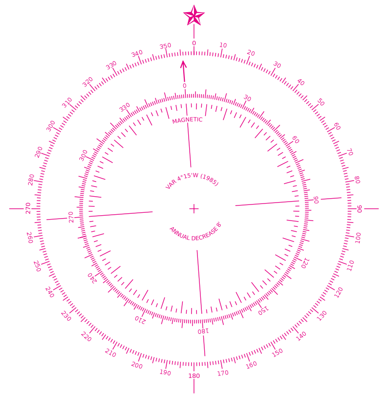
Nautical navigation charts typically contain one or more Compass Roses, also called a Windrose, these consist of two circles – an outer circle that displays the cardinal directions of North, East, South and West and a inner circle that displays the direction of Magnetic North. The Magnetic Declination and its annual rate of change is typically printed within the Compass Rose, it is therefore possible to calculate the Magnetic Declination several years after a map is printed.

In this tutorial I will show you a process that to create a Compass Rose with the correct Magnetic Declination and Annual Rate of Change for any terrestrial location for use in QGIS. First we need to obtain a suitable Compass Rose graphic. Conveniently the United States National Oceanic and Atmospheric Administration (NOAA) published a Compass Rose in the Public Domain i.e. it is free to use without limitation. I downloaded a version of the NOAA Compass Rose from Wikimedia (or you can right click and save the Compass Rose below). Additionally, the background of this Compass Rose is transparent, this allows a map (or indeed a web page) to show though (note the Magnetic Declination in 1985 was 4 degrees 15 minutes west of True North and it had an annual decrease of 8 minutes of a degree per year).

800px-Modern_nautical_compass_rose.svg

There are several handy on-line utilities that can calculate Magnetic Declination and the Annual Rate of Change but we shall use Charles F. F. Karney’s excellent cross-platform GeographicLib in this case. GeographicLib is a suite of command line utilities for solving solving various geodesic problems such as conversions between geographic, UTM, UPS, MGRS, geocentric and local cartesian coordinates, gravity calculations, determining geoid height, and magnetic field calculations. The latest version can be obtained as a pre-compiled binary from Sourceforge or as source code.

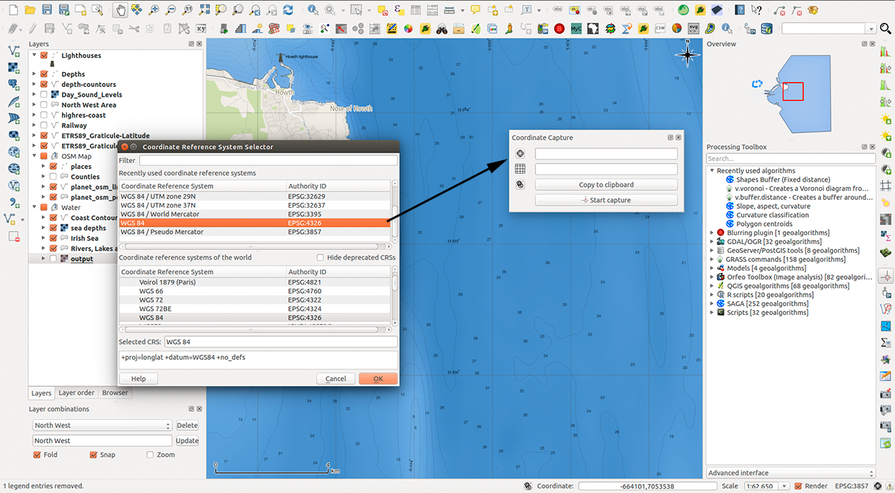
The other essential step is to measure the precise map location in WGS84 coordinates. This can be done using the Coordinated Capture plug-in provided as standard with QGIS. To select the WGS84 coordinate reference system (CRS) click the sphere symbol in Coordinated Capture panel to open the Coordinate Reference System Selector. After setting the CRS to WGS84 (EPSG: 4326), click the icon left of the “Copy to Clipboard” button (this toggles real time display of captured coordinates) and then click “Start Capture”. The position in Decimal Degrees will be updated in the upper window as you move the cursor across the map, the lower window will display projected coordinates (in my case Pseudo Mercator EPSG: 3857). Clicking the map will select a coordinate point and the real time display will cease updating.

Wordpress

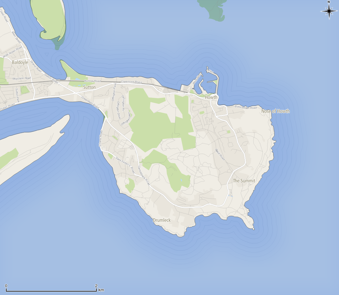
The MagneticField utility of GeographicLib is then used to calculate the Magnetic Declination and Annual Rate of Change for the captured coordinate, in this case a location east of Howth, Ireland.

$ MagneticField -r -t 2014-08-04 --input-string "53.37772 6.00935"

-3.57 67.81 18572.9 18536.9 -1152.2 45528.7 49171.3
0.17 -0.01 17.9 21.2 52.4 19.6 24.9

The results are: Magnetic Declination in degrees (-3.57); the inclination of the Magnetic Field in degrees (67.81); the horizontal strength of the magnetic field in nanotesla (18572.9 nT); the north component of the field (18536.9 nT); the east component of the field in (-1152.2 nT); the vertical component of the field in nT (45528.7 nT) and the total field (49171.3 nT). The numbers on the second line are the annual rate of change of these values, the first number is. We only need the first numbers on each line; the Magnetic Declination (-3.57) and Annual Rate of Change of Magnetic Declination (0.17). We can convert these to Degrees Minutes Seconds if required.

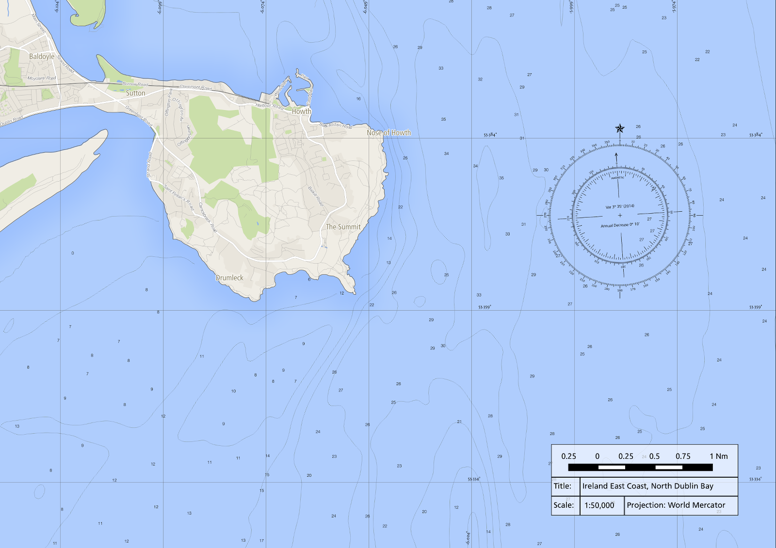
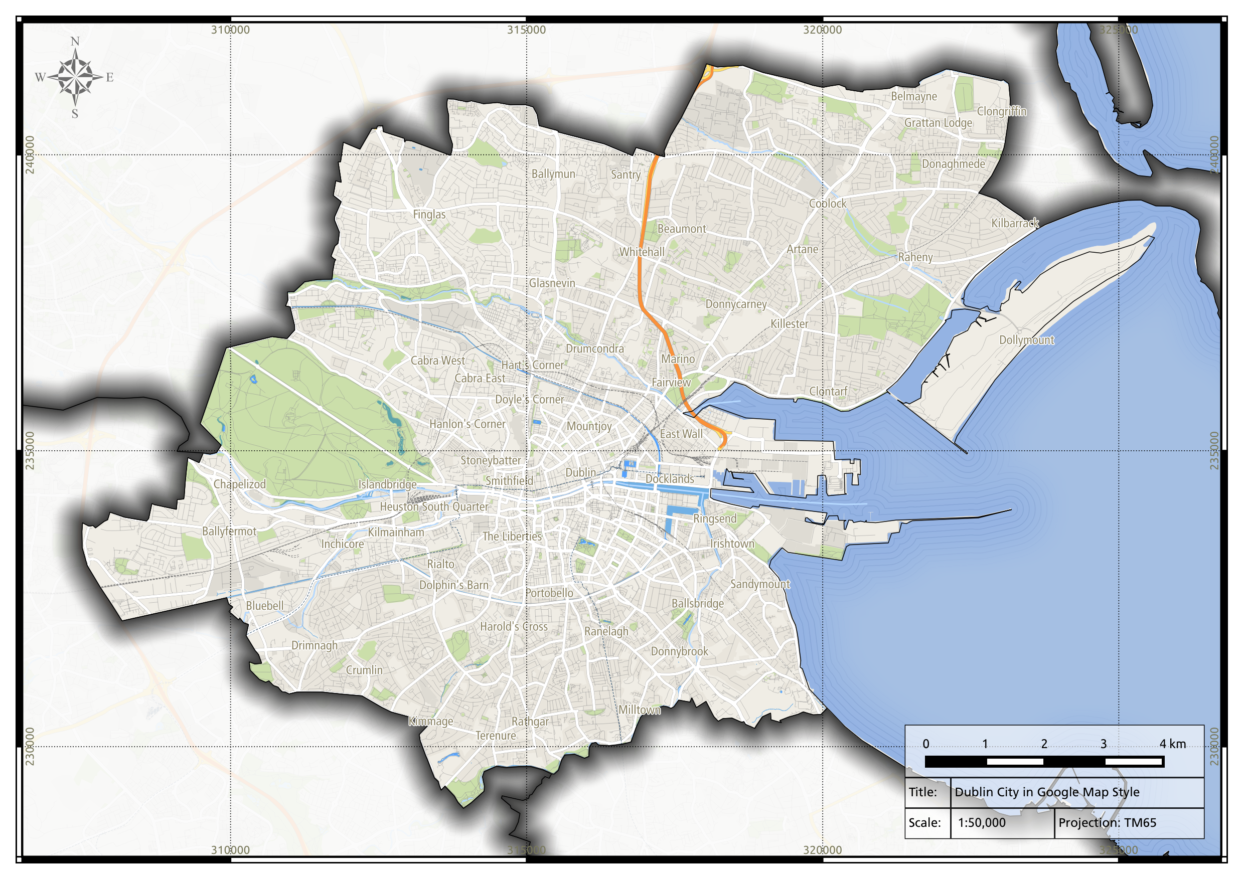
After calculating the Magnetic Declination and Annual Rate of Change, edit the NOAA Compass Rose in a graphics program such as  GIMP or Photoshop. In my case I copied the inner circle to a separate layer and I rotated it 3.57 degrees anticlockwise. I then added text to the Compass Rose stating the Magnetic Declination (Var.) and the Annual Rate of Change (Annual Decrease). After editing the Compass Rose graphic I finally added it to my Nautical Chart as a Image in Map Composer of QGIS.

Further Reading:

Bowditch, N. & ‎National Imagery and Mapping Agency, 2002. CHAPTER 3. NAUTICAL CHARTS. In: The American Practical Navigator: An Epitome of Navigation. Bethesda, MD : Washington, DC, Paradise Cay Publications, 9, 23–50. ISBN: 978-0939837540 http://msi.nga.mil/MSISiteContent/StaticFiles/NAV_PUBS/APN/Chapt-03.pdf

Creating a Nautical Chart in QGIS 2.4

Continuing with a nautical theme, here is a nautical chart I creating using QGIS 2.4. It includes a Graticule in decimal degrees, a Compass Rose and a scale bar in Nautical Miles. A magnetic declination of 3º 35′ was determined using the MagneticField utility of GeographicLib, an advanced software library for solving geodesic problems. I will post a full tutorial shortly.

Nautical Chart for North Dublin Bay

The Coastal Vignette

Vignette2

Coastal Vignette seen on an old Irish ‘6-Inch map’

Occasionally on old maps you may see a pleasing decorative effect on bodies of water called a “Coastal Vignette”, these are fine lines that highlight coastlines and lake shores. The example seen above is from a ca. 100 year old “6-inch map” of Lough Nafooey in County Galway, Ireland. I presume the Coastal Vignette effect in this example was hand drawn, it required considerable skill and patience.

These is no plugin for creating Coastal Vignettes in QGIS just yet, so I developed a simple technique to recreate the effect using the raster Proximity (Raster Distance)’ algorithm accessible in the Processing Toolbox.

In order to use the Proximity Analysis tool I first converted a Shapefile polygon depicting the sea off Dublin into a 10 by 10 metre resolution Raster using the menu command ‘Raster – Conversion – Rasterize (Vector to raster)’.

Box

This generated a Raster that coded the Sea as ‘1’ (white) and ‘0’ (black) for Land.

Next, I selected ‘Proximity (raster distance)’  from the Processing Toolbox – (GDAL/OGR) – [GDAL] Analysis – Proximity (raster distance). You can quickly find the command by typing the algorithm’s name in the box above the Processing Toolbox.

Screenshot5

I entered 0 in the ‘Values’ box, this tells the Proximity algorithm to measure the distance away from land (a value of 0). The resulting Raster contains cell values that correspond to the distance away from the coast in metres, which I styled below.

The final step is to create Contours Lines from the Proximity analysis result using the menu item Raster – Contour. In my case I used an “interval between the contour lines” of 200 metres and I added an Attribute name called “DIST”.

Screenshot7

The resulting contour lines have distance attributes attached to them can be used to create a Graduated colour style if needed, though in my cause I manually edited the attributes of 10 contour lines nearest the coast and I gradually increased the transparency of the mid-grey contour lines from opaque at the coast to fully transparent out at sea. I made the remaining contour lines transparent.

And here is the finished result, with the Sea and an OpenStreetMap base map styled to look just like Google Maps.

Finished Vignette 2

Google Map Style with “Shape Burst” effect in QGIS 2.3

Here’s a nice looking map I created using QGIS 2.3, the testing version of QGIS. I downloaded free OpenStreetMap data and I styled it to look just like Google Maps, as per instructions published by Anita Graser. I also outlined county boundaries using the new “Shape Burst” effect, which creates a pleasing graduated colour pattern that faithfully follows polygon outlines (it’s also applied to the Sea, though it’s quite subtle). I used Data Defined Properties to restrict the effect to all counties except Dublin City, this also created a Mask.

Lastly, there’s also a subtle “Coastal Vignette” effect, these are fine lines that trace the coastline and were typical of old style hand drawn maps. Must have taken a tremendous amount of patience. I developed a simple method of reproducing the effect and I’ll let you know how I did it in my next blog post. Oh and by the way, the scale relates to a map printed at A3 size.


New Online Beginners Course in QGIS 2.2

A US government funded education institution, the National Information Security and Geospatial Technologies Consortium (NISGTC), is offering a free online beginners course to QGIS 2.2 (GST 101 QGIS 2.2). The seven module course is based on the Introduction to GIS course run by Rick Smith with new course material and tutorials specific to QGIS added by Kurt Menke. The course is in beta form at this time with an official launch planed for August 2014 on GitHub, enrolment is open to all.

Here is the course introduction:

Welcome to the QGIS introductory GIS course.  Please note that this course shell is in beta.  We appreciate your willingness to evaluate our course material in preparation for publication in August 2014.  We are very excited that this new series of five complete GIS courses, all based on Open Source Software, will provide educators the curriculum and tools they need to adopt open source GIS software into their GIS programs.

We ask that you follow the sequence of modules presented in the Modules and complete the lab assignments one at a time.  You are welcome to make remarks on either in the discussion area for each module.  Please note that this is a self-paced, open enrollment, course without instructor support or presence.  We make this material available to the public for their own use.  We will publish the course officially on Github in August 2014.  Anyone is welcome to reuse any of the material at that time for their own courses, with attribution under Creative Commons BY license.

NISGTC: GST 101 QGIS 2.2. Course Enrolment Page

10 years of QGIS on Google Trends

Here is a graph showing how often people entered the search term “QGIS” into Google over the last 10 years. It was generated using Google Trends, a Google utility that displays trend graphs and basic regional statistics of search terms entered into the world’s most popular search engine.

QGIS on Google Trends

It’s also possible to compare search terms e.g. QGIS v’s MapInfo, QGIS v’s Microstation, QGIS v’s Geomedia and finally QGIS v’s ArcGIS.

The frequency of most GIS related search terms entered into Google, except “ArcGIS” and “QGIS”, have decreased considerably over the last 10 years. Only ArcGIS is entered into Google more often than QGIS nowadays, indeed ArcGIS has likely attained a monopoly market position. However, it is likely that QGIS will continue to gain ground on ArcGIS and desktop GIS may become a dichotomy of commercial and opensource software, a reaction to one companies’ market dominance.

QGIS Wrocław, Lisboa, Dufour, Valmiera and ?

QGIS 2.4 will be codenamed “Chugiak” in honour of the project founder Gary Sherman who lives in Chugiak, Alaska. This will be the 6th release to bear a codename named after a terrestrial locality, versions 0.8.1 through 1.5 were named after the moons of Jupiter and Saturn e.g. Titan, Io, Tethys etc. The tradition of naming QGIS releases after celestial and terrestrial locations aims to reduce legal risks involving trademarks. QGIS 2.4 will be released at Noon Alaska Time on Friday 20th June (21:00 Irish Standard Time).

Announcement – Swiss QGIS User Group

QGIS Workshop on 1th July, Maynooth

Due to high demand, the All-Island Research Observatory (AIRO) will be holding an another ‘Data for Decisions’ GIS Workshop this summer at NUI Maynooth, before planned autumn workshops.

“The ‘Data for Decisions’ GIS Workshop is aimed at planners, policy and decision makers, local partnerships and local authorities researchers and private consultants who are interested in bringing data to the core of their decisions. The workshop is designed around the free and open source Quantum GIS (QGIS) software package and is pitched at those with minimum or no GIS experience.”

The day long workshop will introduce beginners to QGIS, with an emphasis on manipulating and analysing ‘socio-demographic’ datasets using the free and opensource software. The workshop is accredited by the Irish Planing Institute and members will gain 7 IPI CPD credits. More information can be found on the AIRO website:

AIRO ‘Data for Decisions’ – Intro to GIS Workshop 1st of July 2014